


Flight Pro - White Icon Pack
4.6208.00 Reviews
App Specs
- Version
- 3.9.5
- Updated On
- License
- $2.49
- Downloads
- 50,000+
- Developer
- Nate Wren Design
- Categories
- Personalization
- Platform
- Android
Screenshots
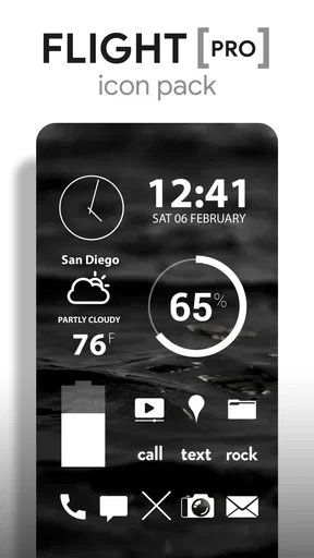
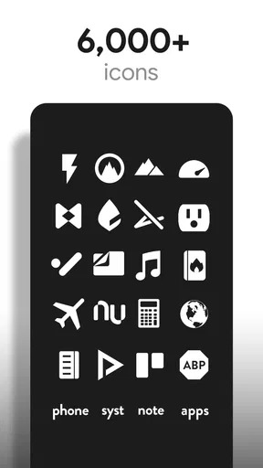
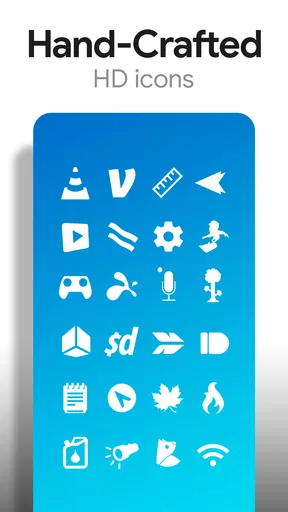
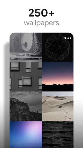
 Analysis by AppCompare
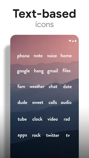
I spent time using Flight Pro - White Icon Pack as a visual refresh for an Android phone, and my first impression was clear: this is aimed at people who want their home screen to feel calm, bright, and deliberately arranged. It is a personalization app from Nate Wren Design, built around a large collection of white, flat-style icons rather than colorful, highly detailed replacements. The look is simple, but getting the best result depends on how much control your launcher gives you and how consistently you want to organize the screen.
The app costs $2.49, carries an Everyone age rating, and currently sits at version 3.9.5. Its store presence shows a 4.6 average from around 1.7 thousand ratings, with more than 50 thousand installs. Those figures suggest a focused audience rather than a mass-market utility, which makes sense: a monochrome icon pack is useful when it matches your taste, but it is not something every Android household will want on every device.
How Flight Pro Works in a Shared Household
The most convincing use case I found was a shared visual setup rather than a complicated customization project. Imagine a household tablet in the kitchen, a spare phone used for music, or an Android device that several people pick up during the day. A consistent white icon style can make that device look less cluttered and easier to recognize at a glance, especially when the wallpaper and widgets are chosen to support the same airy appearance.
That does not mean the pack turns a shared device into a managed family system. It is a visual tool, not a household account manager, parental-control service, or coordination platform. I would not install it expecting separate user profiles, usage rules, child restrictions, or shared task features. Its role is much narrower: it changes the way supported app shortcuts look and helps create a more coherent home-screen layout.
For a family phone, I would be careful before replacing every icon. Children or less technical users often rely on familiar colors and logos, so removing those visual cues can make common apps harder to identify. On the other hand, a shared tablet used mainly by adults may benefit from the quieter design. The right choice depends on whether people navigate by position and name or by the original icon artwork.
One practical approach is to start with the first home-screen page only. I would apply the white icons to the apps everyone uses, leave less common shortcuts unchanged, and ask the other household members whether the result feels clearer or more confusing. This small trial avoids turning a simple style change into a frustrating reorganization of the entire device.
What the visual style changes in daily use
The white treatment makes the wallpaper more important than it would be with standard colorful icons. A pale or busy background can reduce contrast, while a darker sky image gives the icons a cleaner outline. The pack’s visual identity works best when the background has enough empty space behind the shortcuts. If your current wallpaper contains buildings, faces, text, or bright highlights in the same areas as your icons, the result may look less polished than the preview suggests.
Worth Reading Before You Choose

EA SPORTS FC Mobile 26 Is a Bigger Football Game, but It Takes Time
Flipboard Shows What News Apps Must Do Beyond the Feed

Switching to Android Auto Means Rethinking Your Driving Routine
Google Calendar Makes a Crowded Week Easier to Manage
Ludo King Makes the Most of the Minutes Between Plans

Baby Panda World Brings Quick Play to Modern Phones, but Its Game Library Feels Busy
I also noticed a useful trade-off in the restrained design. A row of white icons is visually consistent, but it removes some of the instant color coding that helps me distinguish a camera, map, or messaging app. I found that grouping apps by purpose became more important: communication on one page, household tools on another, and entertainment somewhere else. The pack rewards organization instead of replacing it.
That makes it particularly suitable for someone who wants a low-distraction home screen. It is less suitable for a person who wants every app to stand out individually. If your ideal setup includes colorful badges, expressive illustrations, or a different theme for each folder, this pack will probably feel too uniform.
Setup Boundaries and Launcher Compatibility
Installing an icon pack is only one part of the process. The launcher controls how easily the icons can be applied, whether individual shortcuts can be edited, and how much freedom you have over the grid, labels, folders, and widgets. I would check the launcher already installed on the phone before paying, especially if the device uses a manufacturer interface with limited theme support.
On a compatible launcher, the sensible workflow is to apply the pack globally first, then inspect the home screen for gaps. Not every app shortcut will necessarily have the same visual coverage, and a few unmatched icons can stand out strongly against a fully monochrome layout. Rather than forcing a random replacement, I prefer leaving an unsupported shortcut alone or placing it in a folder where the mismatch is less distracting.
This is one of the less obvious decisions with a white icon pack: consistency is only attractive when it is reasonably complete. A single colorful icon among carefully arranged white shortcuts may look intentional if it represents a household-specific app, but several unrelated exceptions can make the screen appear unfinished. Before changing a shared device, I would take a screenshot of the original layout so it is easy to restore if the household dislikes the new arrangement.
The pack is designed for Android and requires Android 6.0 or later. That makes it accessible to many older devices, but the operating system requirement does not guarantee the same setup experience everywhere. Launcher behavior, manufacturer software, and home-screen permissions can vary. I would treat the launcher as the deciding factor, not the operating-system number alone.
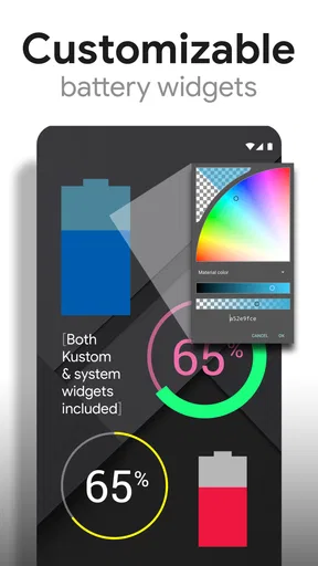
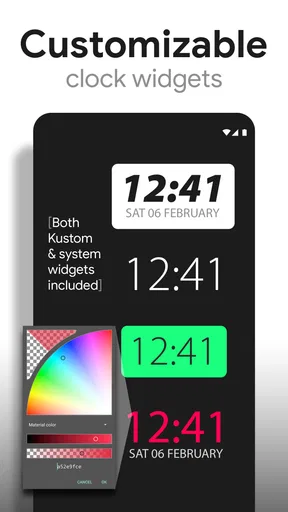
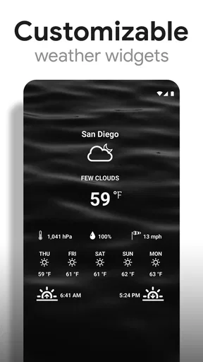
Another boundary is the difference between an icon pack and a complete theme. Flight Pro focuses on icons, with sky-themed wallpapers and clock and weather widgets included in its store summary. Those extra visual elements can help create a unified screen, but they do not automatically redesign every part of the phone. Notification panels, settings menus, lock screens, and app interfaces will generally keep their own appearance.
A careful setup for multiple users
When several people use the same Android device, I would avoid making the change during a busy moment. Photograph the existing home screen, note which shortcuts each person depends on, and make the visual update when everyone who uses the device is available to test it. This is especially useful for older relatives or anyone who is not comfortable troubleshooting launchers.
I would also keep the first page functional. Decorative widgets can look excellent, but a large clock or weather panel may push essential shortcuts into unfamiliar positions. For a household device, predictable placement matters more than achieving a perfectly minimal screenshot. Put the most frequently used apps where people already expect them, then use the pack to refine their appearance rather than forcing a new navigation system.
The included clock and weather widgets are worth considering as part of the layout, but I would not assume that installing them solves every information need. A household may prefer the existing weather provider, a different update style, or a larger accessibility-friendly clock. The advantage here is visual coordination; the potential drawback is that matching appearance can tempt you to replace a widget that already works better for the people using the device.
Coordination Without Turning the Home Screen Into a Puzzle
Good personalization on a shared phone requires agreement about function, not just appearance. I would ask three simple questions before applying the pack: Which apps must remain immediately recognizable? Which shortcuts can move without causing confusion? Does anyone depend on the current colors for accessibility or memory? These questions are more important than whether the icons look impressive in a screenshot.
For a couple sharing a device, the pack can support a tidy arrangement if both people like understated design. I would create folders with plain, descriptive names and keep the most important shortcuts outside them. For a family tablet, I would use the icon style mainly on the adult-facing page and preserve a familiar arrangement on a page used by children. That gives the device some personality without making every user relearn it.
A useful trick is to coordinate by location rather than by icon color. If the messaging app always stays in the lower-left position and the camera remains in the upper row, people can adapt to the white artwork more easily. This is also why I would avoid rearranging icons and changing their appearance at the same time. One change at a time makes it easier to tell whether the issue is the design or the new layout.
There is also a maintenance cost. When a household installs a new app, someone has to decide where it belongs and whether its icon fits the visual system. If the app is supported, the result may be seamless; if not, the new shortcut becomes a visible exception. I actually see this as a useful prompt to keep the home screen under control, but users who install apps frequently may find the ongoing tidying annoying.
The pack is most successful when the household agrees that the home screen is a shared space. If one person wants a colorful gaming shortcut, another wants a practical weather display, and a third wants a completely different launcher, a single visual theme may create more arguments than harmony. In that situation, separate user profiles or a more flexible launcher solution would be a better answer than trying to make one icon style satisfy everyone.
Who benefits most from the white icon approach?
I would recommend it to adults who enjoy minimalist Android customization, people who use dark or atmospheric wallpapers, and anyone who wants a home screen that feels less visually noisy. It also suits a secondary device where a consistent appearance matters more than instant recognition of every individual app.
I would be more cautious with children’s devices, phones used by someone with visual recognition difficulties, and shared hardware where nobody has agreed on a new layout. The Everyone rating describes the app’s age suitability, but it does not mean the design is equally practical for every age group. A child may prefer bright, familiar symbols, while an older user may need stronger contrast or larger labels.
It is also not the best choice for someone who wants a complete phone makeover with animated backgrounds, extensive lock-screen changes, or a broad collection of colorful theme elements. Flight Pro has a specific visual direction. Its strength is focus, and that same focus limits it when your goal is variety.
Age, Trust, and the Purchase Decision
The app is marked Everyone, so its presentation is suitable for a broad audience. In a household, though, age suitability and usability are separate questions. I would let younger users help choose the wallpaper or arrange folders if they use the device, but I would keep the actual launcher changes supervised when the phone contains important communication, school, medical, or household shortcuts.
The listed price is $2.49, and in-app purchases are shown in a range from $1.00 to $50.00 per item. Because of that, I would review the purchase screen carefully before handing the device to a child or allowing someone unfamiliar with Android customization to explore it. The basic buying decision should be made by the device owner, not treated as an accidental part of decorating a shared screen.
I also think trust matters when installing any personalization tool on a family device. The developer is clearly identified as Nate Wren Design, and the app has been available since Jul 29, 2014, with a current version of 3.9.5. Those details make it feel like an established product rather than a brand-new experiment, but they do not remove the need to use the normal Android installation and purchase habits you would apply to any app.
Before buying, I would compare the pack with the launcher’s built-in icon options. Many Android phones now offer basic monochrome or themed-icon settings, and those may be enough if you only want a subdued look. The advantage of this dedicated pack is the more deliberate design language, along with its wallpapers and matching widgets. The disadvantage is that you are adding another customization layer that may require more manual attention when the app list changes.
For a single personal phone, that trade-off is easy to accept if the appearance matters to you. For a household device, I would only pay after confirming that the people who use it actually prefer the new style. A beautiful home screen is not an improvement if it makes everyday actions slower or causes someone to misidentify an essential app.
My Household Verdict After Living With the Design
My overall view is positive, with a clear qualification: Flight Pro is a focused visual tool, not a universal Android theme or family-management solution. The white icons can make a carefully arranged screen feel calmer, and the sky wallpapers plus clock and weather widgets give the design enough material to build a coherent setup rather than a random collection of replacements.
I especially like the way it encourages better home-screen habits. Grouping apps by purpose, keeping important shortcuts in stable positions, and choosing a background with sufficient contrast all make the result more usable. Those decisions matter more than simply applying the pack and hoping the phone instantly looks finished.
Its limitations are equally clear. Launcher support affects the setup, unmatched apps can interrupt the monochrome effect, and the loss of familiar colors may be a real problem for some users. Shared devices need extra care because a visual preference belonging to one person can become a navigation obstacle for another. The included widgets and wallpapers help, but they do not turn the app into a complete household customization system.
If I were recommending it to a friend, I would say this: buy it when you already know you want a white, flat, minimalist Android home screen and you are willing to spend a few minutes arranging it properly. Test the launcher, preserve the original layout, and involve anyone else who relies on the device. If you want bright icons, automatic family organization, or a full interface transformation, I would choose a different kind of customization instead.
For the right user, the modest price is reasonable because the pack has a strong identity and can make an ordinary Android screen feel intentionally designed. For a shared household, its success depends less on the artwork than on cooperation. Used with stable icon positions, sensible contrast, and a little restraint, it is a tasteful upgrade; used without considering the people who share the phone, it can make a familiar device unnecessarily difficult.
Pros
- Clean white icons give home screens a polished
- minimalist appearance.
- Works with many popular Android launchers and is easy to apply.
- Includes matching wallpapers for a more consistent setup.
- Regular updates can add support for newer app icons.
- Simple design blends well with dark and colorful wallpapers.
Cons
- Some less popular apps may use generic or unavailable icons.
- Requires a compatible launcher and is not a standalone home-screen app.
- The monochrome style may reduce visual distinction between app icons.
- Certain launcher features may require manual icon application.
- The white icons can lose contrast on light or bright wallpapers.
FAQs for Flight Pro - White Icon Pack
What is Flight Pro - White Icon Pack?
Flight Pro - White Icon Pack is an Android customization app that replaces compatible app icons with clean, white-themed alternatives. It is designed for users who prefer a minimalist, monochromatic home screen and works through supported launchers rather than changing the entire phone interface by itself. The pack generally includes a large collection of manually designed icons, matching wallpapers, and tools for applying or requesting icons.
Which launchers are compatible with Flight Pro - White Icon Pack?
Compatibility depends on the launcher installed on your Android device. Flight Pro typically works with popular third-party launchers that support icon packs, including options such as Nova Launcher, Lawnchair, Smart Launcher, Action Launcher, and similar applications. Some phone manufacturers’ default launchers may not support third-party icon packs, so you may need to install a compatible launcher before applying the white icons.
How do I apply Flight Pro icons to my Android home screen?
After installing the icon pack, open it and look for the apply option, then select your supported launcher from the list. You can usually also apply the pack from the launcher’s customization or icon settings. If an app is not included, the pack may offer an icon request feature or allow you to apply an individual icon manually. The exact steps can vary depending on your launcher and Android version.
Does Flight Pro - White Icon Pack support every application?
No icon pack can guarantee coverage for every application, especially newly released, regional, or less popular apps. Flight Pro includes many popular icons, but unsupported apps may keep their original appearance or use a generic icon. Before downloading, check the pack’s current icon count and update history. Users can often request missing icons, although fulfillment depends on the developer and future updates.
Is Flight Pro - White Icon Pack free to use, and are there any limitations?
Flight Pro - White Icon Pack is generally offered as a paid customization app, although availability, pricing, promotions, and regional charges can change through Google Play. The purchase normally unlocks the icon collection and available customization tools, but it does not replace the need for a compatible launcher. It is also intended for Android devices, so iPhone and iPad users should not expect native iOS support.


